One of my favorite recent projects was designing can labels for Frank & Ray’s Coffee — a local craft coffee brand with a great product and an even better sense of humor names after my two grandfathers.
The Brief
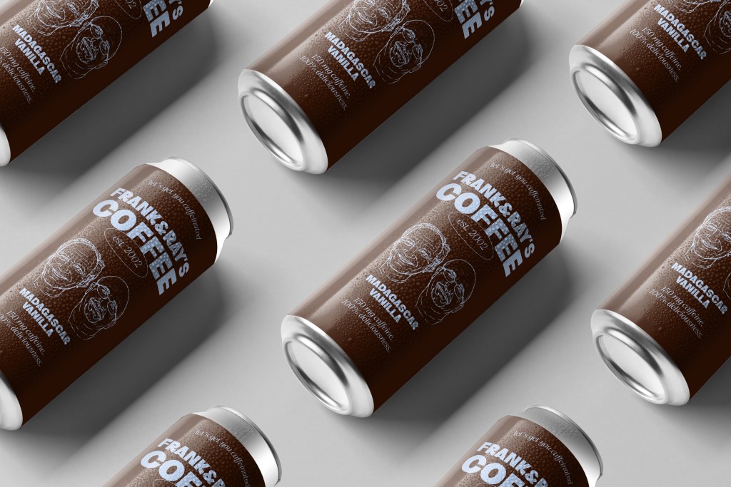
The client wanted something warm, earthy, and approachable — with a nod to old-school Americana without being kitschy. They had a name, a personality, and not much else. That’s my favorite place to start.
Research & Moodboarding
Before touching any design tool, I build a visual language for the project. For Frank & Ray’s I pulled references from vintage coffee tin labels, craft beer packaging, and mid-century American commercial art.
Key themes: hand-drawn illustration elements, earthy browns and terracottas, bold condensed serif typography, and a worn texture that communicated heritage without feeling dated.
Typography
I landed on a condensed slab serif for the brand name — something with presence and warmth. Paired with a hand-lettered style for accent copy like “Small Batch” and “Single Origin” to add personality.
The Color System
The palette: deep espresso brown, warm terracotta, aged cream, and near-black for text. Each blend variant got a subtle color shift while keeping the system unified.
Final Deliverables
Print-ready PDF with bleed and crop marks, layered AI source file, web-optimized PNG, and a brand mini-guide covering color codes and fonts for future consistency.